This article delves into the importance of color psychology in website design, exploring how colors can influence user behavior, enhance brand identity, and improve user experience. The role of color in website design cannot be overstated.
Understanding Color Psychology in Website Design
Color psychology is a field of study that examines how colors impact human emotions and behaviors. Colors have the power to evoke specific feelings; for example, blue can induce a sense of calm, while red might trigger excitement or urgency. In website design, understanding these emotional impacts is crucial for influencing user interaction and perception. Understanding the emotional palette that different colors represent can guide designers in creating more effective and emotionally engaging websites.
The Role of Color in Website Design
The color scheme of a website plays a pivotal role in forming the first impression. Colors not only affect the aesthetic appeal but also influence how long users stay on the page. A well-thought-out color scheme can significantly enhance user engagement and retention, encouraging visitors to explore more content.
Colors are a fundamental aspect of brand identity, helping to convey the brand’s personality and values. Consistent use of brand colors across the website reinforces brand recognition and builds trust with the audience. A mismatch between the brand’s identity and its website’s color scheme can lead to confusion and diminish the brand’s credibility.
Color choices can also affect the accessibility of a website. For users with visual impairments, certain color combinations may be difficult to distinguish. Employing high-contrast color schemes not only enhances readability for all users but also ensures that the website is more inclusive. Thoughtful color selection is essential for creating a positive and accessible user experience.
Strategic Application of Color Psychology in Website Design
Target Audience Analysis
Understanding the target audience is crucial when choosing a color scheme. Different demographics may have varying responses to colors based on age, gender, and cultural background. A deep understanding of the audience helps in selecting colors that resonate well, enhancing the website’s appeal and effectiveness.
Cultural Considerations
Color perception can vary significantly across cultures. For example, while white is associated with purity and weddings in Western cultures, it is often linked to mourning in some Eastern cultures. For websites targeting international audiences, it’s important to consider these cultural differences in color perception.
Color Schemes and Combinations
Selecting the right color scheme is more than just choosing appealing colors; it involves understanding color theory and the psychological effects of color combinations. Utilizing complementary, analogous, or triadic color schemes can create visual harmony and balance, making the website aesthetically pleasing and psychologically effective.
Color psychology in website design influences how users perceive and interact with a website. Different colors can evoke different emotions, convey messages, and significantly impact user experience. Here, we’ll explore the psychology behind various color schemes and combinations, and how they can be effectively applied in website design.
Blue: Trust and Calmness
Psychology: Blue is often associated with trust, calmness, and professionalism. It’s a preferred color for corporate and informational websites where trust is paramount.
Design Application: Ideal for banking, healthcare, and social media platforms.
Visual Example: Imagine a gradient of blue, from light to dark, used in a banking website’s header to evoke a sense of trust and security.
Red: Excitement and Urgency
Psychology: Red can evoke feelings of excitement, passion, and urgency. It’s a powerful color that can stimulate action, making it perfect for call-to-action buttons or sales promotions.
Design Application: Great for ecommerce sites, especially on clearance sales or limited-time offers.
Visual Example: A bright red “Buy Now” button on a white background, creating a stark contrast that draws the user’s attention.
Green: Health and Growth
Psychology: Green is associated with health, growth, and tranquility. It’s used to relax visitors and is popular among wellness and environmental sites.
Design Application: Ideal for spas, organic products, and eco-friendly businesses.
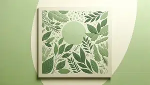
Visual Example: A website for an eco-friendly brand featuring a light green background with leafy patterns, emphasizing nature and sustainability.
Yellow: Happiness and Caution
Psychology: Yellow can signify happiness, creativity, and caution. It’s a bright, attention-grabbing color that can stimulate and uplift but needs to be used sparingly to avoid overwhelming users.
Design Application: Suitable for creative agencies, children’s websites, and cautionary elements.
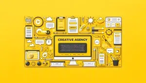
Visual Example: A creative agency’s homepage with a cheerful yellow backdrop, complemented by subtle gray text for balance.
Purple: Luxury and Creativity
Psychology: Purple is often associated with luxury, creativity, and mystery. It’s a versatile color that can lend a sophisticated or imaginative feel to a website.
Design Application: Perfect for luxury goods, beauty products, and creative portfolios.
Visual Example: An online store for luxury goods with a deep purple theme, accented with gold elements to enhance the feeling of exclusivity and elegance.
Orange: Friendliness and Energy
Psychology: Orange combines the energy of red and the happiness of yellow, representing enthusiasm, creativity, and warmth. It’s less aggressive than red, but still draws attention.
Design Application: Used for call-to-action buttons, children’s sites, and leisure activities.
Visual Example: A vibrant orange “Subscribe” button on a lifestyle blog, inviting but not overpowering, set against a soft, neutral background.
Color Combinations
The combination of colors can further enhance the user experience, guiding emotions and behaviors on a website. For example:
Green and Brown: Evoke a sense of nature and organic quality, perfect for eco-friendly and outdoor brands.
Black and Gold: Offer a luxurious and sophisticated feel and often used for high-end products and services.
Common Pitfalls
However, there are also pitfalls to avoid. Overusing bold colors can be overwhelming, causing user fatigue, while too subtle a palette might fail to engage users. Balancing color intensity and using colors strategically are key to avoiding these common mistakes.
Staying Updated with Trends
While it’s essential to be aware of color psychology principles, staying updated with design trends is equally important. However, designers should strive for a balance between trendiness and timelessness to ensure the website remains effective and appealing over time.
Color psychology in website design influences user perception, engagement, and the overall effectiveness of the site. By understanding the emotional and behavioral implications of colors, designers can create more impactful and user-friendly websites. Through strategic application, careful analysis of the target audience, and adherence to best practices, the power of color can be harnessed to enhance website design and achieve business goals.
If you need help with implementing the psychology of colors in branding or other types of website design, like interactive website design or mobile website design, the New Target team is highly experienced and ready to help.


