IDSA
Industrial Design’s Digital Hub
When your client is the Industrial Designers Society of America, very little of your website design will elude creative scrutiny. Like under a jeweler’s eye, every facet must be correct, functional and beautiful.
The redesign of IDSA.org has created a vibrant digital hub for the IDSA community where great ideas are exchanged freely between a global membership.
IDSA had five primary goals:
- To migrate their content from a Drupal CMS to a WordPress CMS for greater control,
- To improve the usability and streamline navigation for a large website with over 20,000 pages,
- To integrate the new website with their association management system, Fonteva,
- To serve their membership in new, innovative, and helpful ways, and
- To produce a digital experience that is beautiful while delivering an outstanding members-first experience.

Results
Year-over-Year
Year-over-Year
Year-over-Year

Creative Design
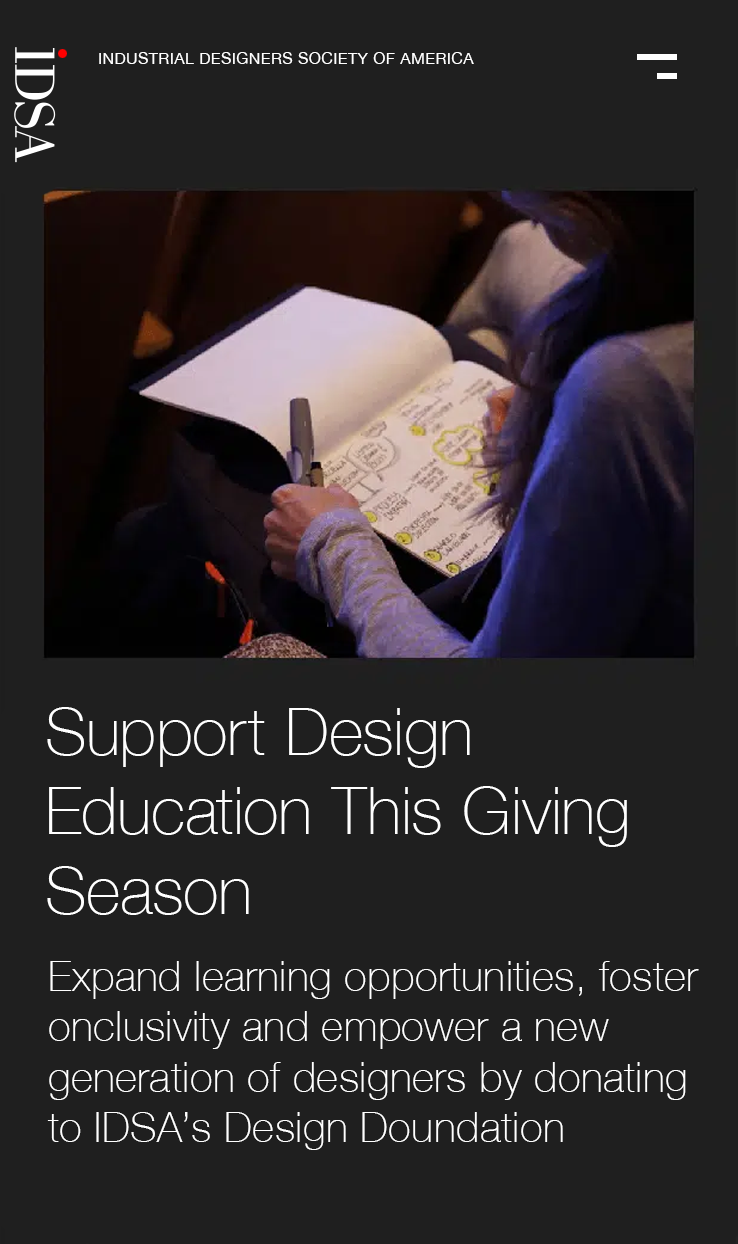
IDSA’s brand story has received an exciting, colorful makeover that gives a vibrant new look to their much-loved industrial design content. Featuring dynamic photos of members in action, the visual feast captures the dynamic spirit and value of being part of this amazing association, by showing us what words cannot!
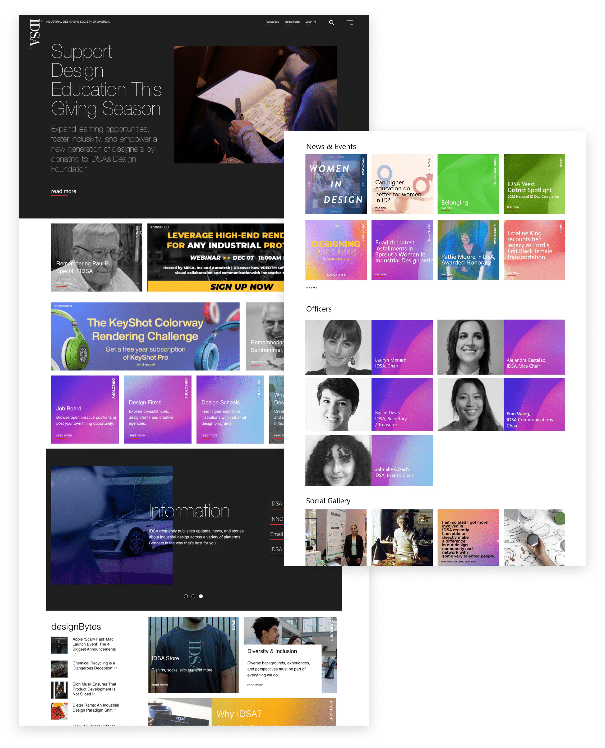
The new IDSA home page is tailored to all types of members, from the curious, to the seasoned professional. It features a fun and stylish tile-based member experience where content is broken into neat sections for easy access. As you explore each section, curated sliders present additional links related to that viewer’s intent. Our design achieved the goal of creating an engaging visual experience while empowering members with useful information.
Members-first Design
We used an innovative combination of user data and feedback to design a comprehensive new version of IDSA.org! Our member research revealed the most popular usage patterns from members and visitors alike, while community suggestions helped us pinpoint where we could enhance their experience even more. With this knowledge in hand, our team was able to develop a creative approach and website that optimizes a member’s journey throughout the website.
Usability & Navigation
IDSA.org visitors have a clear mission in mind when they come to the website, and now with its new navigation design, we’re ready to help them achieve their goals. Featuring an intuitive expanding menu accessible on the top right corner of any page, users can easily discover content grouped into five categories – each containing various subsections for further exploration. So, whether you’re looking for inspiring stories about industrial designers or just some info that’ll help get your designs off the ground quicker, this association website will be your guide!
Purposeful Microsites
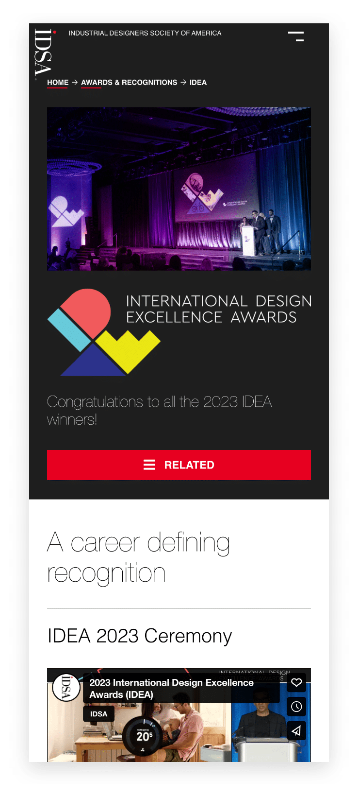
With the new “Microsites,” members and guests can attend conferences, stay included in competitions or explore past winners in a much more enjoyable and interactive journey. Instead of individual pages that need to be searched through, visitors will find themselves presented with refreshed content organized into delightfully purposeful sub-navigation links at their fingertips. And no matter where on the site you are navigating from, it will always feel familiar thanks to its consistent design elements throughout all purpose-driven Microsite versions available.
Members-first Features
Profiles
IDSA community members are the lifeblood of all that they do. Everyone who joins, speaks, is elected to a position, or lends their time and energy towards their local chapters, serves an important role. To commemorate these efforts in style, every individual can now create a visual history of their activities with IDSA over time. In addition to a profile statement and headshot, they’ll be able to see (and keep updating!) contributions made at conferences, meetings, and events hosted by working groups or even within regional chapters! Each profile acts as an ever-growing record of their involvement in driving change within IDSA.
Member Directory
IDSA’s directory is a powerful expression of every member’s commitment to their craft and career. However, there were many technical complexities behind the scenes in order for this roster to be displayed securely online. The all-new membership directory allows current members more networking opportunities than ever before. Whether a member is looking through casually or taking advantage of intricate details, the design encourages the user to explore, make connections, and further their design career.
Members-Only Content
The new website lets IDSA members unlock exclusive content like designBytes – a massive 20-year collection of over 1,750 reference articles as well as the latest issues of their inhouse INNOVATION magazine directly on IDSA.org with just one sign-on and no fussing around in back-end wizardry.
Community Connection
Accessibility
Because IDSA is committed to creating an inclusive and accessible experience for all their visitors, we’ve added the UserWay web accessibility tool. This awesome feature gives every visitor with visual or audio needs a way to customize their browsing by adjusting things like text size, spacing, or even screen readers that provide real time readouts of each page. And throughout development we applied current Web Content Accessibility Guidelines (WCAG) standards – because everyone deserves access to an enjoyable site-surfing session.
Educational Papers
IDSA is proud to bring you a trove of peer-reviewed academic research papers written by leading educators. These pioneering works provide invaluable content for their annual Education Symposium and give authors the opportunity to reach beyond their usual circles with meaningful contributions. To help maximize exposure, IDSA has launched an exclusive online archive section dedicated solely to education papers. We make it easier than ever to find these valuable resources the IDSA community needs, in one convenient location.


How we did it.
The cornerstone of your identity is an authentic brand story. We work with you to establish a clearly defined brand strategy for your goals – a strategy complementary to your brand’s visual voice.
The creative we design is heavily influenced by the framework for innovation. We design media not just to please our clients, but to engage and delight their customers, members, or constituents. We put people first.
We’ll help you select the right technology, and code it right. Our development team is passionate about using the right mix of open source, off-the-shelf, and hosted solutions to solve complex problems.
We understand clients have a choice of website hosting providers. Our service goes beyond stability, up time, and more to a personalized approach that meets you where you are today, and prepares you for your tomorrow
From search engine marketing strategies to social management to campaign activations and monitoring, we create bespoke digital marketing strategies for your audience.


