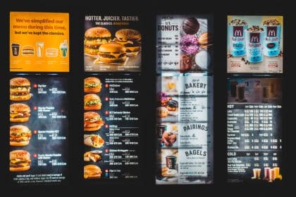
In the world of website design, there are a lot of different navigation options to choose from. But when it comes to giving visitors the best possible experience on your site, a mega menu is hard to beat. Not sure what a mega menu is or if your site could benefit from one? Keep reading to find out.

What is a Mega Menu?
A mega menu is a drop-down menu that contains more than just links to other pages on your site. A well-designed mega menu will also include images, descriptions, and even links to external resources. Basically, it provides everything a visitor needs to know about a particular topic all in one place.
When Should You Use a Mega Menu?
Certain types of sites can really benefit from using a mega menu for navigation. Here are five of them:
E-commerce Sites
If you have an e-commerce site with a lot of products and categories, a mega menu can be a lifesaver. By including images and descriptions in your mega menu, you can help visitors find exactly what they’re looking for without having to click around your site for ages. And we all know how frustrating that can be.
Sites with Lots of Content
If your site has tons of articles, blog posts, etc., a mega menu can help visitors find the content they’re looking for without feeling overwhelmed. By grouping similar content together in your mega menu, you can make it easy for visitors to find what they’re looking for without getting lost in an endless sea of links.
Sites with Multiple Languages
If your site is available in multiple languages, a mega menu is a great way to let visitors know which language they’re currently viewing your site in and give them the option to switch to another language with just one click. This can be especially useful if you have international visitors who might not be familiar with the default language on your site.
Sites with Multiple User Types
If your site has different content for different user types (e.g., students, parents, teachers), a mega menu can be used to segment that content, so users only see the stuff that’s relevant to them. This can save users a lot of time and frustration trying to find the right content on your site.
When Not to Use a Mega Menu
One situation where you might not want to use a mega menu is if your website doesn’t have many products or categories. If you only have a few items on your website, then this type of menu might not be necessary. Additionally, if your website is already easy to navigate without a mega menu, then you probably don’t need one.
Another situation where you might not want to use a mega menu is if you’re worried about usability issues. If you think that your users might find the mega menu confusing or difficult to use, then you might want to avoid using one. Additionally, if having one might slow down your website, then you should consider another option.
New Target Knows Navigation
When it comes to choosing the right navigation option for your website, there’s no one-size-fits-all solution. It all depends on your individual needs and preferences. However, if you have a lot of content that you want to showcase in your navigation menu, then using a mega menu could be the best option for you.
Keep in mind that mega menus can take up quite a bit of space on your website, so they’re not always the best choice from a design standpoint if you don’t need one.
We are experts in web design and navigation and will always organize your content, creating a unique navigation strategy based on your needs. Get started today!


